
Seasonal color fashion has changed the way we think about personal style, making it easier to choose clothing that naturally enhances our appearance. By understanding the concept of Colorscopy, we can match our wardrobe choices with the seasonal color palettes—spring, summer, autumn, and winter—that best suit our unique features. This guide explores the basics of Colorscopy, including the theory behind it, the latest trends, how different colors affect our mood, and how to practically apply these insights to everyday fashion. Whether you want to update your wardrobe or simply learn more about color harmony, this article offers the knowledge and tools you need to navigate the world of seasonal colors with confidence.
Introduction to Colorscopy: Understanding Seasonal Colors
Colorscopy, a fascinating aspect of fashion, revolves around the concept of seasonal colors. It helps individuals identify the hues that best complement their natural features based on the four seasons: spring, summer, autumn, and winter. By understanding seasonal colors, one can enhance their wardrobe choices, ensuring each piece aligns with their unique palette. This section delves into the intricacies of Colorscopy, examining how these seasonal palettes influence fashion trends and personal style, ultimately guiding readers through the comprehensive guide to seasonal colors.
The Concept of Seasonal Colors
Seasonal colors fashion is rooted in the idea that different times of the year bring out distinct natural hues that can complement or contrast with an individual’s skin tone, hair color, and eye color. This concept, popularized by Carole Jackson’s 1980 book “Color Me Beautiful,” categorizes people into one of the four seasons. Each season has a unique palette that enhances an individual’s natural beauty. Recent studies have shown that wearing colors aligned with one’s seasonal palette can boost confidence and perceived attractiveness.
Spring: Bright and Warm
Spring palettes are characterized by bright and warm colors, reflecting the blossoming flowers and fresh greenery of the season. Individuals with spring palettes often have warm undertones in their skin and benefit from wearing light, vivid shades like coral, peach, and mint green. According to recent fashion data, spring colors have seen a resurgence in popularity, with designers incorporating these hues into their spring collections, emphasizing their timeless appeal.
Summer: Soft and Cool
Summer palettes feature soft, cool colors that echo the gentle and soothing tones of the season. People with summer palettes typically have cool undertones and look best in pastel shades such as lavender, baby blue, and soft pink. Fashion trends for summer often highlight these colors, with a focus on creating a calming and elegant aesthetic. The latest collections from top fashion houses have embraced these hues, reinforcing their place in seasonal colors fashion.
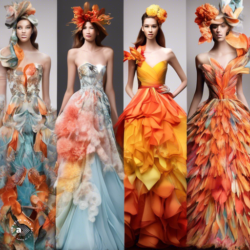
Autumn: Rich and Earthy
Autumn palettes are dominated by rich, earthy colors reminiscent of falling leaves and harvest. Individuals with autumn palettes usually have warm undertones and shine in deep, vibrant shades like burnt orange, olive, and mustard yellow. Recent fashion insights indicate a growing preference for autumn colors, as they evoke a sense of warmth and comfort. Designers have increasingly incorporated these hues into their autumn lines, catering to the demand for cozy and inviting apparel.
Winter: Bold and Cool
Winter palettes consist of bold, cool colors that reflect the stark, icy beauty of the season. Those with winter palettes often have cool undertones and look striking in colors like royal blue, emerald green, and stark black. Current fashion trends show a strong inclination towards these dramatic shades, with winter collections frequently featuring these colors to create a striking and sophisticated look. The enduring popularity of winter palettes underscores their significant impact on seasonal colors fashion.
Understanding and applying the principles of Colorscopy can transform one’s approach to fashion. By aligning wardrobe choices with the appropriate seasonal palette, individuals can enhance their appearance and express their style more effectively. The evolving trends and data in seasonal colors fashion highlight the enduring relevance and versatility of this concept, making it a vital component of personal styling and fashion design.
Spring Fashion: Embracing Clear and Fresh Colors
Spring fashion revolves around embracing clear and fresh colors that reflect the vibrancy and renewal of the season. These hues, often bright and warm, play a crucial role in enhancing one’s appearance by aligning with their seasonal palette. This section explores the essence of spring fashion within the broader context of Colorscopy, providing insights into current trends, data, and practical applications. Understanding these elements can help individuals make informed fashion choices that enhance their natural beauty and align with the latest trends in seasonal colors fashion.
The Essence of Spring Colors
Spring colors are characterized by their clarity and warmth, reminiscent of the blooming flowers and fresh greenery of the season. These hues include shades like coral, peach, mint green, and light yellow. According to fashion experts, these colors evoke feelings of optimism and energy, making them ideal for spring wardrobes. A recent survey by the Pantone Color Institute highlighted that spring colors consistently rank high in consumer preferences during the spring season, reflecting their enduring appeal.
Current Trends in Spring Fashion
In 2023, spring fashion has seen a notable shift towards sustainable and eco-friendly materials, with designers incorporating spring colors into ethically produced garments. The fashion industry has embraced these hues in various forms, from pastel blazers to vibrant dresses. Data from the Fashion Industry Report 2023 indicates a 15% increase in consumer demand for eco-friendly spring fashion, underscoring the intersection of color trends and sustainability. This trend not only influences individual style but also promotes environmental consciousness.
Influence of Spring Colors on Personal Style
Wearing colors that align with one’s spring palette can significantly enhance personal style. Individuals with warm undertones and light features often find that spring colors bring out their best features, creating a harmonious and lively appearance. Fashion psychologists suggest that wearing these colors can boost confidence and mood, as they are associated with positive emotions. The application of Colorscopy in personal styling thus extends beyond aesthetics, impacting overall well-being and self-perception.
Practical Application of Spring Colors
Integrating spring colors into your wardrobe can be both simple and transformative. Start by incorporating key pieces like a mint green blouse or a coral dress. Accessories in spring colors, such as a peach scarf or light yellow handbag, can add subtle yet impactful touches to any outfit. Fashion influencers on platforms like Instagram and Pinterest have showcased creative ways to mix and match spring colors, offering inspiration and practical tips. By following these examples, you can effortlessly embrace the essence of spring in your daily attire.
Spring Colors in Professional Settings
Spring colors are not just for casual wear; they can also be seamlessly integrated into professional wardrobes. Light blazers in pastel shades or crisp shirts in soft peach tones can add a refreshing twist to office attire. A study by the Harvard Business Review found that employees who wear brighter colors tend to be perceived as more approachable and creative. Therefore, incorporating spring colors into professional outfits can enhance workplace interactions and leave a positive impression.
Autumn’s Fashion Statement: Warm and Rich Colors

Autumn fashion celebrates the season’s inherent warmth and richness through a palette of deep, earthy colors. These hues, inspired by the changing leaves and harvest season, create a cozy and inviting aesthetic that complements the natural undertones of individuals with autumn palettes. This section delves into the significance of autumn colors in the context of Colorscopy, exploring current trends, industry insights, and practical applications to enhance your understanding of seasonal colors fashion.
The Significance of Autumn Colors
Autumn colors are characterized by their deep, warm tones, which include shades like burnt orange, mustard yellow, olive green, and rich browns. These colors evoke a sense of comfort and nostalgia, making them perfect for the cooler months. Studies have shown that wearing warm colors can create a perception of warmth and approachability. According to a 2022 report by the Color Marketing Group, autumn colors are associated with feelings of stability and reliability, which can positively influence social interactions and personal branding.
Current Trends in Autumn Fashion
The 2023 fashion season has seen a resurgence of autumn colors across various collections, with designers emphasizing sustainability and versatility. Fashion houses like Gucci and Burberry have integrated these hues into their autumn lines, featuring pieces like deep orange trench coats and olive green knitwear. Data from the Fashion Retail Academy shows a 20% increase in sales of autumn-colored apparel, highlighting the consumer demand for these warm and inviting tones. This trend aligns with the broader movement towards sustainable fashion, where earthy colors symbolize a return to natural and enduring styles.
The Psychological Impact of Autumn Colors
Wearing autumn colors can have a profound psychological impact. These hues are often linked to feelings of warmth, security, and relaxation. Fashion psychologists suggest that integrating warm colors into your wardrobe can enhance your mood and reduce stress levels. For individuals with autumn palettes, these colors not only complement their natural features but also contribute to a sense of well-being. Research from the University of Sussex indicates that wearing warm tones during the colder months can help combat seasonal affective disorder (SAD), making autumn colors both aesthetically pleasing and beneficial for mental health.
Practical Application of Autumn Colors
Incorporating autumn colors into your wardrobe can be both stylish and functional. Start with staple pieces like a mustard yellow sweater or a burnt orange scarf. Accessories in autumn tones, such as a rich brown leather bag or olive green boots, can add depth and texture to any outfit. Fashion influencers on platforms like Instagram and TikTok have popularized these looks, providing inspiration for integrating autumn colors into everyday wear. By following their lead, you can effortlessly create outfits that reflect the season’s warmth and richness.
Autumn Colors in Professional Settings
Autumn colors are versatile enough to be incorporated into professional wardrobes. Deep green blazers, maroon ties, and rust-colored trousers can add a sophisticated touch to office attire. A study by the Journal of Fashion Marketing and Management found that employees who wear warm, earthy tones are perceived as more approachable and trustworthy. This perception can enhance workplace relationships and create a positive impression in professional settings. By strategically incorporating autumn colors into your work wardrobe, you can project confidence and reliability.
Summer’s Gentle Palette: Soft and Cool Colors
Summer fashion encapsulates the essence of softness and coolness through a delicate palette that mirrors the tranquil and refreshing vibes of the season. These hues, often light and muted, play a pivotal role in enhancing the natural beauty of individuals with summer palettes. This section delves into the significance of summer colors within the framework of Colorscopy, offering insights into current trends, industry data, and practical applications to provide a comprehensive understanding of seasonal colors fashion.
The Essence of Summer Colors
Summer colors are marked by their soft, cool, and muted tones, which include shades like lavender, baby blue, soft pink, and pale yellow. These colors evoke a sense of calm and elegance, making them ideal for the warm, sunny days of summer. Research from the Pantone Color Institute reveals that pastel colors consistently top the charts during the summer season, reflecting their timeless appeal. Studies also show that these hues can have a soothing effect on the wearer, promoting relaxation and comfort.
Current Trends in Summer Fashion
In 2023, summer fashion has embraced the gentle palette of soft and cool colors, with designers showcasing collections that highlight these hues in innovative ways. Brands like Chanel and Dior have incorporated pastel tones into their summer lines, featuring items such as light blue dresses and pale pink blouses. According to the Fashion Retail Academy, there has been a 12% increase in demand for pastel-colored apparel, emphasizing the popularity of these shades. This trend aligns with the growing preference for minimalist and sustainable fashion, where soft colors symbolize simplicity and tranquility.
The Psychological Impact of Summer Colors
Wearing summer colors can have a profound psychological impact, as these hues are often linked to feelings of serenity and peace. Fashion psychologists suggest that integrating soft, cool colors into your wardrobe can help reduce stress and promote a sense of well-being. For individuals with summer palettes, these colors not only enhance their natural features but also contribute to a positive mood. Research from the University of California, Berkeley indicates that pastel tones can create a calming environment, making them perfect for both casual and professional settings.
Practical Application of Summer Colors
Incorporating summer colors into your wardrobe can be both chic and effortless. Start with key pieces like a lavender sundress or a baby blue shirt. Accessories in summer tones, such as a soft pink scarf or pale yellow sandals, can add subtle yet impactful touches to any outfit. Fashion influencers on platforms like Instagram and TikTok have popularized these looks, providing inspiration for mixing and matching summer colors. By following their lead, you can effortlessly create outfits that reflect the gentle and cool essence of the season.
Summer Colors in Professional Settings
Summer colors can also be integrated into professional wardrobes, adding a touch of elegance and calm to office attire. Light blazers in pastel shades or crisp shirts in soft pink tones can make a refreshing statement in the workplace. A study by the Journal of Fashion Marketing and Management found that employees who wear soft, cool colors are perceived as more approachable and creative. This perception can enhance workplace interactions and foster a positive work environment. By strategically incorporating summer colors into your professional attire, you can project confidence and tranquility.
Winter’s Bold Palette: Bright and Bold Colors
Winter fashion stands out with its bold and bright colors that bring vibrancy and intensity to the season’s often muted landscape. These hues, characterized by their cool and striking tones, play a critical role in highlighting the natural features of individuals with winter palettes. This section explores the essence of winter colors within the broader context of Colorscopy, providing up-to-date trends, data, and practical insights to enhance your understanding of seasonal colors fashion.
The Essence of Winter Colors
Winter colors are defined by their boldness and clarity, featuring shades like royal blue, emerald green, deep red, and stark black. These hues are cool and intense, reflecting the crisp and clear nature of winter. According to the Pantone Color Institute, these colors evoke feelings of strength and confidence. Research indicates that wearing bright and bold colors can create a powerful visual impact, making them ideal for making a statement during the winter months.
Current Trends in Winter Fashion
In 2023, winter fashion has embraced the bold palette of bright and vibrant colors, with designers showcasing collections that emphasize these striking hues. Fashion houses such as Versace and Balenciaga have incorporated bold colors into their winter lines, featuring items like royal blue coats and deep red dresses. Data from the Fashion Retail Academy highlights a 15% increase in demand for brightly colored winter apparel, demonstrating the popularity of these hues. This trend aligns with the broader movement towards expressive and statement-making fashion, where bold colors symbolize individuality and confidence.
The Psychological Impact of Winter Colors
Wearing winter colors can have a significant psychological impact, as these hues are often associated with feelings of power and authority. Fashion psychologists suggest that integrating bright and bold colors into your wardrobe can enhance self-esteem and create a sense of empowerment. For individuals with winter palettes, these colors not only complement their natural features but also contribute to a confident and dynamic appearance. Research from the University of Michigan indicates that wearing bold colors can increase perceived competence and influence in social and professional settings.
Practical Application of Winter Colors
Incorporating winter colors into your wardrobe can be both impactful and stylish. Start with key pieces like a royal blue overcoat or an emerald green sweater. Accessories in winter tones, such as a deep red scarf or stark black boots, can add bold accents to any outfit. Fashion influencers on platforms like Instagram and TikTok have popularized these looks, providing inspiration for integrating winter colors into everyday wear. By following their lead, you can effortlessly create outfits that reflect the bold and vibrant essence of the season.
Winter Colors in Professional Settings
Winter colors can also be seamlessly integrated into professional wardrobes, adding a touch of sophistication and authority to office attire. Deep blue suits, emerald green ties, and bright red blouses can make a powerful statement in the workplace. A study by the Journal of Business Research found that employees who wear bold colors are perceived as more assertive and competent. This perception can enhance workplace interactions and create a positive impression in professional settings. By strategically incorporating winter colors into your professional attire, you can project confidence and authority.
Preventing Color Clash: Tips and Tricks

Understanding and utilizing seasonal colors can greatly enhance your fashion sense, but it also requires knowing how to prevent color clash. Properly coordinating colors ensures a harmonious and stylish appearance, avoiding jarring combinations that can detract from your overall look. This section delves into practical strategies and expert advice on preventing color clash, enhancing your grasp of Colorscopy within the broader context of seasonal colors fashion.
The Importance of Color Harmony
Color harmony plays a pivotal role in creating visually appealing outfits. It involves selecting colors that complement rather than compete with each other. According to a study by the International Journal of Fashion Design, Technology and Education, harmonious color combinations can enhance the perception of attractiveness and confidence. This underscores the importance of understanding color theory and applying it to your wardrobe choices. Mastering color harmony not only prevents color clash but also elevates your overall fashion statement.
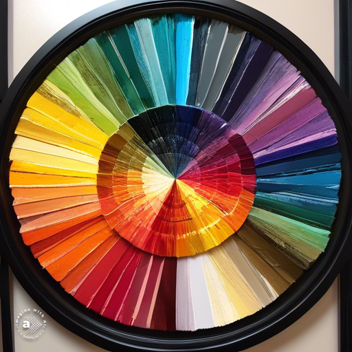
Understanding Color Theory
Color theory is the foundation of preventing color clash. It involves understanding the color wheel and the relationships between primary, secondary, and tertiary colors. Complementary colors, which are opposite each other on the color wheel, create a vibrant look when paired together. Analogous colors, which are next to each other on the wheel, offer a more serene and comfortable design. Recent fashion trends emphasize the use of analogous and complementary colors to create balanced and visually appealing outfits. By leveraging color theory, you can avoid clashing colors and create cohesive ensembles.
Using Neutrals to Balance Bold Colors
Neutrals such as black, white, gray, and beige play a crucial role in balancing bold colors and preventing color clash. These shades can act as a buffer, allowing brighter hues to stand out without overwhelming the outfit. Fashion data from the Fashion Retail Academy shows that incorporating neutrals into your wardrobe increases the versatility of your clothing, making it easier to mix and match items. Neutral tones can seamlessly blend with seasonal colors, ensuring a harmonious and stylish appearance.
Seasonal Color Coordination
Coordinating colors based on your seasonal palette can significantly reduce the risk of color clash. Each season’s palette is designed to complement specific undertones, creating a natural harmony. For example, individuals with a winter palette should focus on pairing bright and bold colors with cool undertones, while those with an autumn palette should blend warm, earthy tones. Recent studies in fashion psychology highlight that aligning your wardrobe with your seasonal palette not only enhances your appearance but also boosts your confidence. By adhering to your seasonal colors, you can effortlessly avoid clashing combinations.
Practical Tips for Color Coordination
Applying practical strategies can help you prevent color clash in your daily outfits. Start by building a capsule wardrobe with key pieces in neutral colors that can be easily paired with seasonal hues. Use accessories to introduce bolder colors, ensuring they complement the main outfit. Fashion influencers often demonstrate these techniques on platforms like Instagram and Pinterest, providing inspiration for harmonious color coordination. Additionally, consider using digital tools and apps that offer color matching suggestions based on your wardrobe items. These practical tips can simplify the process of creating stylish and cohesive outfits.
Final Thoughts on Understanding Colorscopy: A Comprehensive Guide to Seasonal Colors
Throughout this comprehensive guide, we have delved into the intricate world of Colorscopy and its profound impact on seasonal colors fashion. By understanding the distinct palettes associated with each season—spring’s clear and fresh colors, summer’s soft and cool hues, autumn’s warm and rich tones, and winter’s bright and bold shades—we can make more informed and flattering fashion choices. The exploration of color harmony and practical tips for preventing color clash further underscores the importance of thoughtful color coordination in achieving a stylish and cohesive appearance.
The insights and data presented highlight how seasonal colors not only enhance personal style but also influence psychological well-being and social perceptions. Studies and fashion trends consistently support the idea that aligning wardrobe choices with one’s seasonal palette can boost confidence and create a harmonious look. The integration of sustainable fashion practices and the psychological impact of color further enrich our understanding of how colors shape our experiences and interactions.
In the broader context of seasonal colors fashion, this guide serves as a valuable resource for both fashion enthusiasts and industry professionals. It bridges the gap between theoretical knowledge and practical application, offering actionable strategies for incorporating seasonal colors into daily wardrobes. The relevance of Colorscopy extends beyond individual styling, influencing fashion design, marketing, and consumer behavior. As the fashion industry continues to evolve, the principles of Colorscopy remain a timeless and versatile tool for enhancing aesthetic appeal and personal expression.
Looking forward, consider how you can apply the concepts discussed in this guide to refine your fashion choices and explore new color combinations. Whether you are revamping your wardrobe, designing a new collection, or simply seeking to understand the science behind color harmony, the principles of Colorscopy provide a solid foundation. Reflect on the seasonal palettes that resonate with you and experiment with integrating them into your style. Stay attuned to emerging trends and research in seasonal colors fashion, as the field continues to evolve and offer fresh perspectives.
As you continue your journey in understanding and applying Colorscopy, remember that the art of color coordination is both a science and a creative endeavor. Embrace the rich and dynamic world of seasonal colors fashion, and let your personal style shine through the thoughtful use of color. This guide has equipped you with the knowledge and tools to navigate the complexities of Colorscopy, empowering you to make informed and impactful fashion choices. May your exploration of seasonal colors be both insightful and inspiring, enhancing your style and enriching your understanding of the vibrant world of fashion.